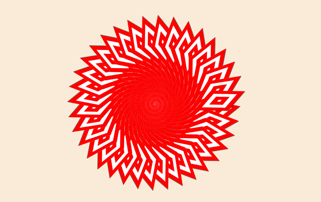
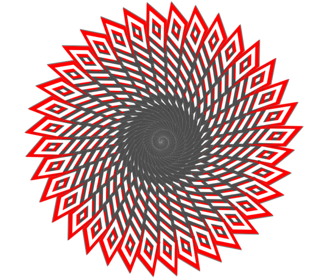
Let’s keep the spirit of Nashville Design Week going and dive into how we can quickly build some fun designs, like the one you see above, using SASS & CSS.
We’re going to keep it simple and use CodePen for our challenge this time around.
All we need in our html file is a <ul> tag and an <li> tag….well, 500 <li>’s but I’m going to make it easy on you. Hop on into this CodePen for a head start.
So, now we need to do a little bit of styling to that massive amount of <li> tags.
Go ahead and copy this bit of code over to your head start pen:
 ul li {
    list-style: none;
    position: absolute;
    padding: 5px;
    box-shadow:rgba(0, 0, 0, .6) -1px 2px 0px;
    transform-origin: center bottom;
    background: rgb(255, 255, 255);
    border: double 50px red;
    mix-blend-mode: normal;
  }
 ul {
    position: absolute;
    left: 45%;
    top: 40%;
  }
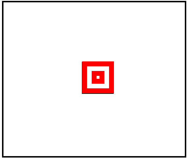
Once that is copied over you should have something that looks like this:
Now that all the boring stuff is out of the way, we are about 15 lines of code away from some really neat designs.
This last bit of code is going to be using SASS and an @for rule. It might look a little complicated at first but once you see what it does and how it works, your creativity is going to soar to new heights. Alright, let’s transform that square into something a little more fun.
This is the code that is going to make the magic happen. (I’ll explain it below)
li {
    $translateX: 1;
    $translateY: 1;
    $rotate:1;
    $skew: 40;
    @for $i from 1 through 500 {
      &:nth-child(#{$i}) {
        transform: rotate(#{$rotate}deg) skew(#{$skew}deg)
          translate( #{$translateX}px, #{$translateY}px);
        $translateX: $translateX + .05;
        $translateY: $translateY + .5;
        $rotate: $rotate + 10;
      }
   }
}
Let’s quickly break down the code snippet above.
The first part of our ‘li’ is assigning a starting point for our transform property.
$translateX: 1;
$translateY: 1;
$rotate:1;
$skew: 40;
Our first <li> will begin with transform: rotate(1deg) skew(40deg) translate(1px, 1px);
Simple enough, right?
Alright, next we will set up our @for rule.
@for $i from 1 through 500 {
      &:nth-child(#{$i}) {
        transform: rotate(#{$rotate}deg) skew(#{$skew}deg)
          translate(#{$translateX}px, #{$translateY}px);
      }
“from 1 though 500” means we are going to apply this property to all 500 of our <li> tags.
As for the transform property inside our @for rule, it is pretty straightforward. It is simply linking our starting points to our property.
For example, skew(#{$skew}deg) becomes skew(40deg) by pulling our starting point $skew: 40;
Boom. Last and easiest part now.
$translateX: $translateX + .05;
$translateY: $translateY + .5;
$rotate: $rotate + 10;
This will allow each of our <li>’s to increase by the increments we setup. For instance, the first <li> will start with rotate(1deg), the second rotate(11deg), then rotate(21deg), and so on.
And that’s it! Check out the final result below (best viewed at 0.5x)
Now we have an awesome design and the tools to create more!
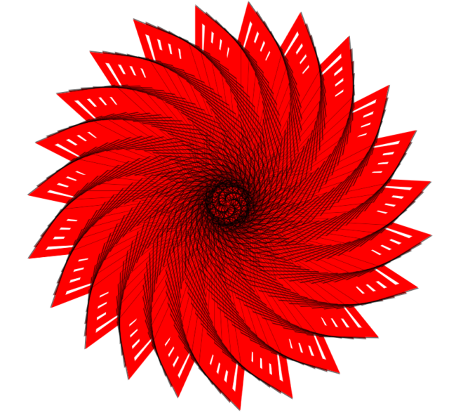
Below are some example of how making very small changes to this code can have really interesting effects on the designs. The possibilities are limitless!
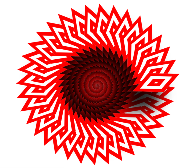

$rotate: $rotate + 100;
mix-blend-mode: luminosity;
Now it’s your turn! As always, we’d love to see what you create.
Tag us on twitter @designups and we’ll check it out!

