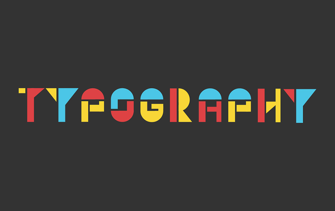
What is Typography?
Design-wise, typography is the visual style or stylization of text. It is all around us from the menu at your favorite restaurant to the shampoo bottle in your shower. Still, it can be one of the hardest things to work and experiment with when you first start designing. The importance of typography is something that designers must understand and learn master over time.
Typography is the art and science of arranging typefaces to communicate a message effectively. Selecting appropriate typefaces for body copy is crucial to enhance readability and user experience.
Definition and Importance of Typography in Design
Typography is the art and science of arranging typefaces to communicate a message effectively. It is a crucial aspect of design, as it can make or break the visual appeal and readability of a text. Good typography is essential in design, as it helps to establish a strong visual hierarchy, provides a graphic balance to the website, and sets the product’s overall tone. It also plays a significant role in building brand recognition, influencing decision-making, and holding the attention of readers.
In essence, good typography reinforces the message you want to convey, making it more engaging and easier to understand. Whether you are designing a website, a brochure, or a product label, the way you arrange your text can significantly impact how your audience perceives and interacts with your content. By paying attention to typography, you can create designs that are not only visually appealing but also effective in communicating your message.
Brief History of Typography
Typography has a rich history that dates back to the 11th century, during the innovation of movable type. The first example of typography can be seen in the Gutenberg Bible, which kick-started a typography revolution in the West. The style of type used in the Gutenberg Bible is now known as Textura, and it can be found in the font dropdown menu on major desktop applications today. With the birth of the internet came a creative explosion of the art of typography, and today, typography is an essential aspect of web design.
The evolution of typography has been marked by significant milestones, from the introduction of serif fonts in the Renaissance to the development of sans serif typefaces in the 19th century. Each era brought new styles and innovations, reflecting the cultural and technological changes of the time. Today, the digital age has opened up endless possibilities for typography, allowing designers to experiment with web fonts, variable fonts, and responsive typography to create dynamic and engaging designs.
Why is Typography Important?
While most design visually stimulates the brain, the job of typography is two-fold. First, the typography must be laid out as an element of the overall design and seen with the bigger picture. Unlike with other design elements, typography also has to be looked at as something to be read and set up to be comfortable for a viewer to do so. This is why it is important to spend extra time to experiment and perfect typographic elements in any design. Here are a few tips and things to remember when taking on typographic design:
The Basics of Typography Design
It may be obvious, but it is always important to address the details and many of these basics will remind you to pay attention to those details. This strengthens your designs and may even save you from having to change things later. For example, kerning is the space between particular characters and while some fonts have naturally good kerning, others require the designer to go in and make small adjustments. Establishing visual hierarchy is crucial for guiding the reader’s eye through the content, ensuring that the most important elements stand out. There are so many other basics to typography and Adobe has a great resource for learning them called Typography 101: A crash course of terms to know.
In addition, the role of white space in improving readability and creating balance within the design cannot be overstated. Thoughtful use of white space enhances the overall aesthetic experience, guides viewer attention, and facilitates better organization of related text and graphic elements.

Principles of Good Typography
Good typography is not just about choosing a pretty font; it’s about creating a visual hierarchy that guides the reader’s eye through the content. Here are some principles of good typography:
Hierarchy and Visual Organization
A well-designed typographic hierarchy helps to distinguish between prominent pieces of copy that should be noticed and read first and standard text copy. This is achieved by using different font sizes, weights, and styles to create a clear visual hierarchy. A good typographic hierarchy should be easy to follow, with clear headings, subheadings, and body text.
By establishing a typographic hierarchy, you can ensure that your audience knows where to look first and how to navigate through your content. This is particularly important in web design, where users often skim through pages quickly. Using a combination of serif and sans serif fonts can help create contrast and emphasize different levels of information, making your design more engaging and easier to read.
Consistency and Alignment
Consistency is key to good typography. Using the same font style throughout a design helps to create a cohesive look and feel. Alignment is also crucial, as it helps to create a sense of order and balance. Text should be aligned to a grid or a baseline to create a sense of harmony.
When your typography is consistent and well-aligned, it enhances the overall readability and professionalism of your design. Consistency in font choices, line spacing, and alignment ensures that your text looks polished and intentional. This not only makes your design more aesthetically pleasing but also helps to build trust and credibility with your audience.
Contrast and Emphasis
Contrast is essential in typography, as it helps to create visual interest and draw attention to important information. Contrast can be achieved by using different font sizes, weights, and styles, as well as color and negative space. Emphasis is also important, as it helps to highlight important information and create a sense of hierarchy.
In conclusion, good typography is essential in design, as it helps to create a visual hierarchy, establish a strong brand identity, and communicate a message effectively. By following the principles of good typography, designers can create designs that are both visually appealing and easy to read.
Pair Serif Typefaces Wisely
Almost every project will involve the use of two or three fonts and knowing how to pair them is essential. Typically, opposites attract when it comes to pairing fonts and experimentation or trial and error is necessary in my opinion. There are many resources that can be helpful in deciding on what fonts to pair. Websites where you download fonts like Adobe Fonts will sometimes show pairing suggestions. There are also pairing generators like this one on designs.ai. Some websites even have font pairs that you can download together like this pairing called Highrush that I found on Envato Elements.

Think About How People Will Interact with Your Visual Hierarchy
This tip applies in multiple ways. You must think about what product you are designing for such as a brochure versus a website. This is extremely important because there are specific things to remember when designing for different platforms or assets. One of the biggest factors that dictates typography is whether it is being designed to be digital or printed. Therefore, there are specific things to think about when designing for the web such as color accessibility.
You must also think about what message is behind the content, brand, etc. and what style and personality is associated with it. For example, the “Wake Up Call” design below is for a modern, Bauhaus inspired restaurant so I tried to design the text to convey that. I used a sans serif font as a secondary font and made the main font myself based on Bauhaus art. Both of these fonts portray the modern, structured, and playful style of the restaurant.
The “Dizzy” design might utilize very similar colors to the “Wake Up Call” design, but they send very different messages and convey different vibes. The design utilizes a script font as a callout to the St.Louis Cardinals Logo and pairs it with a serif font to convey the classic feeling and visual associated with baseball.
Let Other’s Use of Negative Space Inspire You
Typography is all around us and we see it every day so we should pay attention to it and let it inspire us. Besides getting inspired by the world around you, you can also go online to find inspiration. Pinterest is always a good way to get inspired and Envato has an inspiring article listing 50 Creative Typography Ideas and Examples
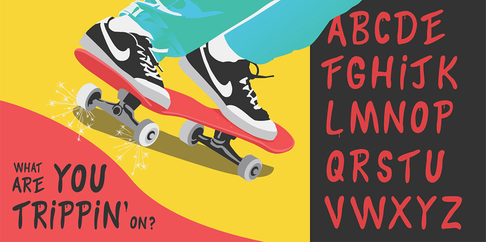
Make Your Own Fonts!
Making your own font is something most graphic designers might have done before, but if you haven’t you should definitely give it a shot! There is not one specific way to design your own font. I made the font on the “Trippin” image below by drawing a few letters by hand, tracing them on Adobe Illustrator, and then creating the rest of the letters based on the results. On the other hand, I made the “Wake Up Call” font by using specific geometric shapes to form each letterform in Illustrator.