There is a moment most Nashville founders recognize. You have a product you believe in, a team you have built carefully, and a pitch that gets people leaning forward in their seats. Then someone — a prospective investor, an enterprise customer, a senior hire you are trying to land — pulls up your website. And you watch their face. The product is serious. The brand looks like a side project.
Nashville startup branding is one of the most consistently under-invested areas in the local ecosystem — and one of the most consequential. The city’s startup market has grown substantially over the past decade, with particular density in healthtech, fintech, music technology, and SaaS. These companies are competing not just locally but nationally and internationally. A Nashville startup that looks provisional when it meets a coastal investor or an enterprise procurement team is leaving credibility, and often money, on the table.
This playbook covers what founders actually need to know to build a brand from zero: the strategic foundation most skip, how to approach naming, what a visual identity needs to do, and the five mistakes that consistently set early-stage companies back. It is practical and direct, because that is what the decision deserves.
Your brand is not your logo
Most founders think branding means a logo and some colors. It does not. That misconception is worth correcting at the outset, because founders who treat branding as a visual exercise almost always end up redesigning their brand eighteen months later once the strategic gaps become visible.
Branding is the sum of every impression your company makes. The visual identity — logo, palette, typography — is the expression of your brand. It is not the brand itself. The brand is the strategic foundation underneath: what your company stands for, who it is specifically for, how it is different from every alternative including doing nothing, and what it should feel like to encounter it.
This matters especially for startups, for a specific reason. Established companies have history, customer relationships, and earned reputation doing the trust-building work for them. A startup has none of that. Its brand has to do all of that work from day one, in the absence of a track record. A startup that skips the strategic foundation and goes straight to visual design is building on sand.
A startup brand has three jobs to do simultaneously: signal credibility to investors, customers, and potential hires who have no prior reference point for the company; differentiate from competitors, including more established players with more resources; and attract the specific people and organizations you want, while quietly repelling the ones you do not. A logo cannot do any of that without strategy behind it.
The strategic foundation: four questions before you touch a design tool
Every startup that rushes to visual design without completing brand strategy ends up in the same place: a brand that looks fine but does not hold together under pressure. The strategic foundation is the work most founders skip because it feels abstract. It is the work that determines whether everything that follows will actually perform.
Answer these four questions honestly before you brief any designer or agency. They form the brief that good brand work requires.
The four questions every Nashville startup must answer first
-
Who are you for — specifically?
The temptation is to say everyone, or a broad category. This is a branding death sentence. Great brands are built for a specific person with a specific problem. The narrower and more honest the definition, the more powerfully the brand resonates. Test: describe your ideal customer in one specific sentence. If you cannot, the strategy is not done.
-
What do you actually believe?
Brand values are not the words that sound good in a pitch deck. They are the convictions that drive how your company behaves — what you will and will not do, what you genuinely care about. Authentic values differentiate. Generic values (integrity, innovation, excellence) create noise. Test: name one real decision your company has made that reflects each stated value.
-
What is your single most important point of difference?
Not a list of features. One thing: the most important reason your ideal customer would choose you over every alternative. This becomes the strategic core of your brand. Every expression — tagline, website, pitch deck — should trace back to it. If your point of difference is a feature a competitor can copy in six months, you have a product strategy problem too.
-
What should people feel when they encounter your brand?
Not think — feel. Brand operates primarily in the emotional register. Three to five specific words: not ‘professional’ (a category) but ‘confident’, ‘energized’, ‘reassured’. These emotional targets directly inform every downstream design decision: color, typography, photography style, copywriting tone.
A startup that arrives at a branding engagement with clear answers to all four questions will get a significantly better outcome than one that says ‘we’ll figure it out as we go.’ Designers and agencies do their best work when the brief is honest and specific.
Naming: more consequential than most founders realize
Brand naming is one of the most consequential and most underestimated decisions a startup makes. A bad name creates friction at every stage of the company’s life — with investors who cannot remember it, journalists who cannot spell it, enterprise procurement teams who cannot trademark-clear it, and customers who cannot find it on Google. A good name does positive work from day one.
Naming is a strategic problem, not a creative one. The name needs to accomplish specific, non-negotiable objectives: it must be memorable, pronounceable, available as a domain and across key social platforms, defensible as a trademark, and ideally meaningful in a way that reinforces your positioning without requiring a paragraph of explanation.
There are five broad approaches to startup naming, each with meaningful trade-offs:
- Descriptive names (what you do) are easy to understand but hard to protect and often generic. They work when category ownership is the goal and trademark risk is low.
- Evocative names (what you feel or suggest) are more distinctive and more durable, but require explanation early on. Stripe, Slack, Figma — none of these describe what the product does, but all of them are now the category.
- Founder name build on personal reputation and feel authentic, but create succession risk and can feel limiting as the company scales beyond its origins.
- Invented words (Xerox, Kodak, Sonos) offer maximum distinctiveness and trademark protection at the cost of maximum explanation overhead. They take longer to establish but are impossible to replicate.
- Acronyms and initialisms are almost always a fallback, rarely strategic, and reliably forgettable. Avoid unless there is a compelling specific reason.
Before committing to any name, check: .com domain availability (still the B2B credibility standard), USPTO trademark clearance (do a basic search at minimum; pay for a legal clearance before significant brand investment), social handle availability across the platforms that matter for your category, and for startups planning international expansion, unintended meanings in target markets.
One Nashville-specific note: names that connect authentically to the city’s identity — its culture of music, entrepreneurialism, and community — can build genuine local goodwill and press interest in a market that actively supports its own. The operative word is authentically. A forced geographical reference does the opposite.
Visual identity: what it needs to do, not just how it needs to look
Once the strategic foundation is in place, visual identity is the most visible expression of the work — and for a startup, it is doing credibility-signalling at every touchpoint simultaneously. Here is what each component needs to accomplish.
The logo
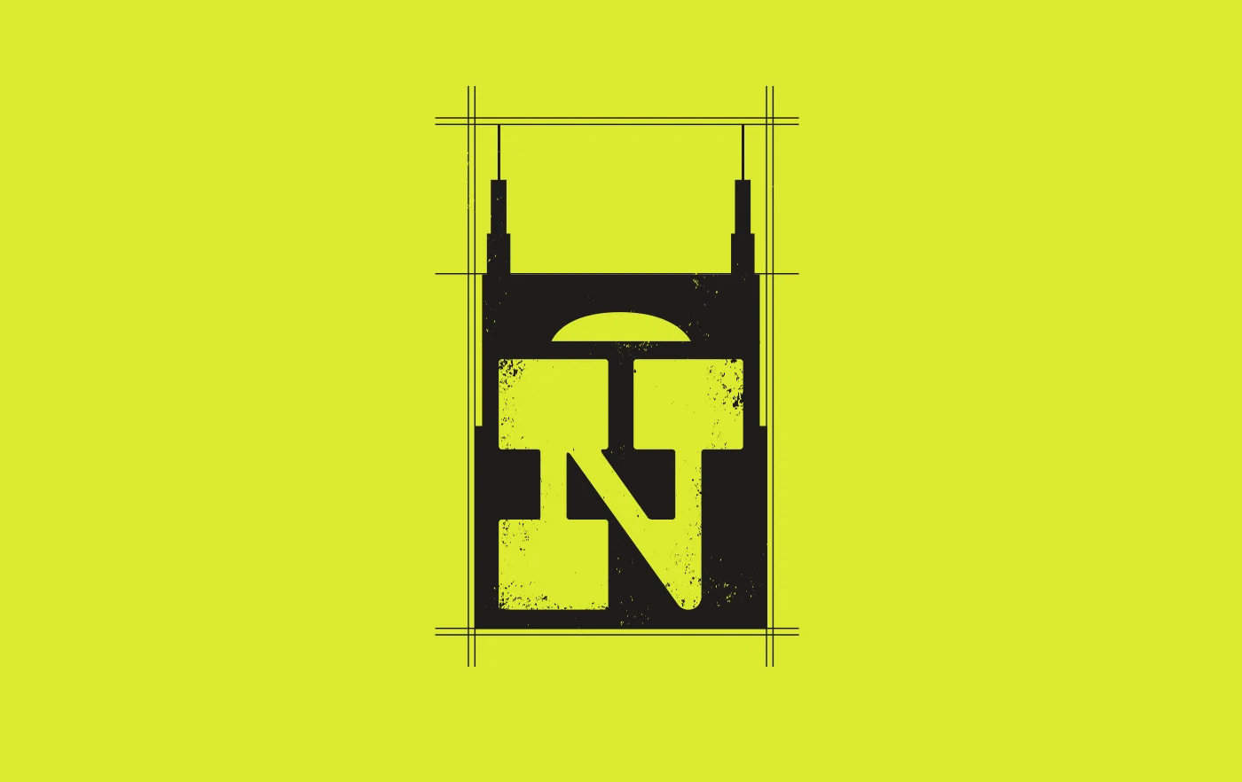
The logo is not your brand, but it is the most recognizable expression of it. For startups, the primary requirement is versatility: the logo must work at the top of a pitch deck, as a 32-pixel favicon, in a Slack channel, on merchandise, and in a press release — often in contexts you cannot anticipate when you commission it. Commission at minimum three variants: horizontal lockup, stacked, and a standalone icon or mark, in both light and dark versions. A logo that only works at one size or on one background color is going to create problems.
Color palette
Color is the most emotionally immediate element of a visual identity — it communicates brand personality before a word is read. A working startup palette typically needs: one primary brand color, one secondary color, neutral tones for backgrounds and text, and functional color for UI states. The strategic question is always: what does this palette communicate, and is that aligned with the emotional targets from your brand strategy? The practical warning for Nashville startups: do not default to the palette of successful companies in your category. Every healthtech company does not need to be dark blue. Every consumer brand does not need to be millennial pink. The companies that look like the category blend into it.
Typography
Typography communicates personality more subtly than color but just as powerfully. The choice between a serif and a sans-serif, a geometric and a humanist typeface, is the difference between ‘established and authoritative’ and ‘modern and approachable’ — and that choice needs to be made in the context of your positioning, not your personal taste. For digital-first startups, web font performance matters: choose typefaces that render well at screen resolution and load quickly. A practical type system for an early-stage company: one primary typeface for headings and brand communications, one secondary typeface for body copy and UI, a clear hierarchy of sizes and weights that the whole team can apply consistently.
Brand guidelines
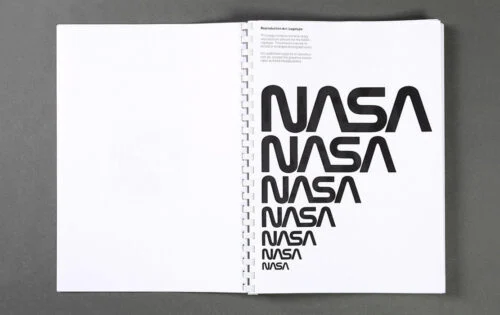
Brand guidelines are not bureaucracy. They are the infrastructure that allows a growing team to maintain consistency without a brand manager reviewing every output. Without them, the brand drifts as the team grows — different departments develop their own interpretations, contractors work from memory, and the consistency that is the foundation of brand recognition erodes. A minimal but functional brand guidelines document covers: logo usage rules and clear/incorrect examples, color values in every relevant format (HEX, RGB, CMYK), the type system, photography and imagery direction, and tone of voice with examples. This does not need to be a hundred-page PDF. It needs to be clear, specific, and actually used.
Your website is the brand’s first real test
For a startup, the website is where the brand either holds up or falls apart. It is where investors go after a pitch meeting, where candidates go before accepting an offer, where enterprise customers go to decide if this company is real. A startup with a weak website is fighting with one hand tied behind its back in every one of those conversations.
The website’s job is not to impress. It is to communicate three things, immediately and without ambiguity: what the company does, who it is for, and why anyone should choose it over every alternative. Founders consistently underestimate how hard this is to do clearly. The language that makes sense inside the company — the shorthand, the category terms, the internal framing — almost never makes sense to a first-time visitor who has no prior context.
The most common startup website failure is prioritizing visual ambition over communicative clarity. A site that is visually striking but communicatively opaque is a brand problem dressed up as a design success. The second most common failure is no clear primary call to action: what do you want a first-time visitor to do? If the answer is unclear in the design, the conversion rate will reflect it.
Performance matters as much as design. A beautiful website that takes four seconds to load on mobile is losing visitors before it has made a single impression. Google’s Core Web Vitals — the set of performance metrics that affect search ranking — should be treated as design requirements from the outset, not as post-launch optimization tasks.
Five mistakes that set Nashville startups back
These are the patterns that appear consistently in early-stage branding work. Knowing them in advance is considerably cheaper than learning them through experience.
- Building the brand around the founder’s taste instead of the customer’s experience.
The brand is for your customers, not your aesthetic preferences. A founder who loves minimalism should not build a minimalist brand if their customers associate minimalism with coldness and their category calls for warmth. Brand strategy starts with the customer’s world, not the founder’s. - Treating branding as a one-time project rather than an ongoing capability.
The strongest startup brands are built once at a strategic level, then maintained and evolved deliberately as the company grows. A brand commissioned once and left unmanaged drifts within eighteen months as the team grows and the company evolves. Build the brand system; then actually use it. - Going too cheap on the initial brand build.
A logo bought for five hundred dollars on a freelance marketplace will cost fifteen thousand dollars to replace when the company raises a Series A and the brand no longer reflects the company’s ambition, credibility, or scale. Investing in strategic branding early is almost always cheaper than rebranding under time pressure later, when the stakes and the calendar pressure are both higher. - Separating brand from product.
For product-led startups, the brand experience does not stop at the marketing website. It continues through the product UI, the onboarding flow, support interactions, error messages, and every other touchpoint. Treating brand and product as separate workstreams creates inconsistency that customers feel even when they cannot name it. The strongest SaaS and consumer tech brands are seamless from the marketing site through to the product itself. - Waiting until the brand is perfect before shipping it.
A functional brand in market, collecting feedback and building recognition, is worth infinitely more than a perfect brand still in revision. Ship the brand, observe how it performs in the real world, and iterate from evidence rather than assumption. The goal at the early stage is not perfection — it is a brand that is good enough to open doors and honest enough to attract the right people through them.
Brand is not a milestone. It is a capability.
The Nashville startups that will be remembered, funded, and grown into the companies this city will be proud of in ten years will almost all have one thing in common: they took their brand seriously before they needed to.
Not because branding is a prerequisite for great products. It is not. But because the founders who invest in understanding what their company stands for, who it is for, and how it communicates that consistently do not just look better than their competitors. They think more clearly. They attract better investors and talent. They build customer relationships that compound over time. The brand work forces the strategic clarity that everything else is built on.
Nashville has produced world-class companies, world-class music, and a business culture that the rest of the country is paying increasing attention to. The startups building here deserve brands that match that ambition — not as decoration, but as infrastructure.
Ready to build a brand that matches your company’s ambition?
DesignUps is a Nashville-based branding and web design agency that has worked with startups from concept to launch — including Foundation Devices, a bitcoin hardware startup that needed a brand capable of earning trust in one of the most skeptical markets in the world. We’d love to hear what you’re building. Let’s Talk!