A New Look with Purpose
Our brand identity is the foundation of the entire DesignUps experience.
The DesignUps origin story began in 2009 when founder Simon Carr was working on music row in Nashville, TN. In the early days the company was known as work/by/simon. After a couple of successful years it became obvious that the brand needed to evolve to be less personal and more aspirational.
In 2012 the transition to the DesignUps brand began. It felt good to have a new identity, but it was only the beginning of a new chapter. Today DesignUps is recognized as a leader in interactive design and development. Our previous brand served us well for nearly a decade, but our ambitious view for the future created a need for a new presence.
Defining our Brand
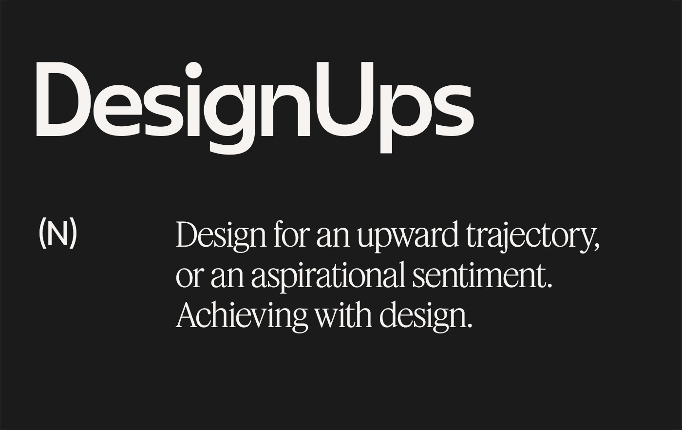
Definition of DesignUps
DesignUps (noun). Design for an upward trajectory, or an aspirational sentiment. Achieving with design.
Our brand name is a combination of two words which both imply movement. The name DesignUps is unique because it can have many interpretations, but above all it is memorable and thought provoking.
![]()
DesignUps Logo Lockup
Our Symbol and Logotype
We choose to base the updated brandmark around the idea of upward movement and being elevated by design. The brandmark symbolizes our focus on technology with reference to a mouse cursor, while also being simplistic and open to interpretation. We believe that the brandmark captures our ambition and passion.
DesignUps Logo Animation
Bringing the Logo to Life
Cool logo, but does it move? Yes, it does! The name of the company is directional and infers motion so we wanted a simple but unique way to present the brand on video platforms. The logo animation will be used for digital marketing campaigns and as an introduction to our brand anywhere motion content is used.
![]()
Brand Icons
Uniquely Styled Icons
Graphic elements are a key component of the DesignUps toolkit. Our goal was to have an unexpected and elevated brand language. Bold and dynamic shapes create ownable patterns and through the use of repetition they reinforce our unique voice and branding. The brand iconography comes to life with animations on the new website.
Brand Typography
Typography that Feels Fresh
Our two primary typefaces are Feature Deck and Gilroy. The contrast between the elegant serif and the utilitarian sans serves as a nice contrast. Gilroy can be used vertically or horizontally, while Feature Deck is the primary font used for headline and attention grabbing statements. The updated typography allows us to stand out amongst other brands in our space and it gives a new presence to our content strategy and social media content.
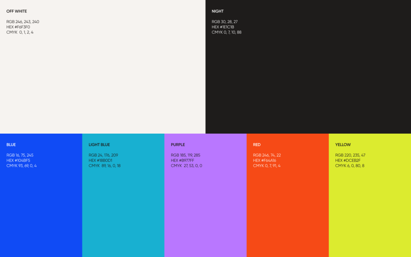
Brand Color Palette
Picking the Right Colors
For several years our brand colors have been vibrant with a focus on gradients. For the rebrand we settled on using off-white and near-black to make up the majority of the brand. This ensures plenty of white space in the designs, and allows for distinct visual hierarchy throughout each layout. Our secondary brand colors communicate vibrance and freshness.
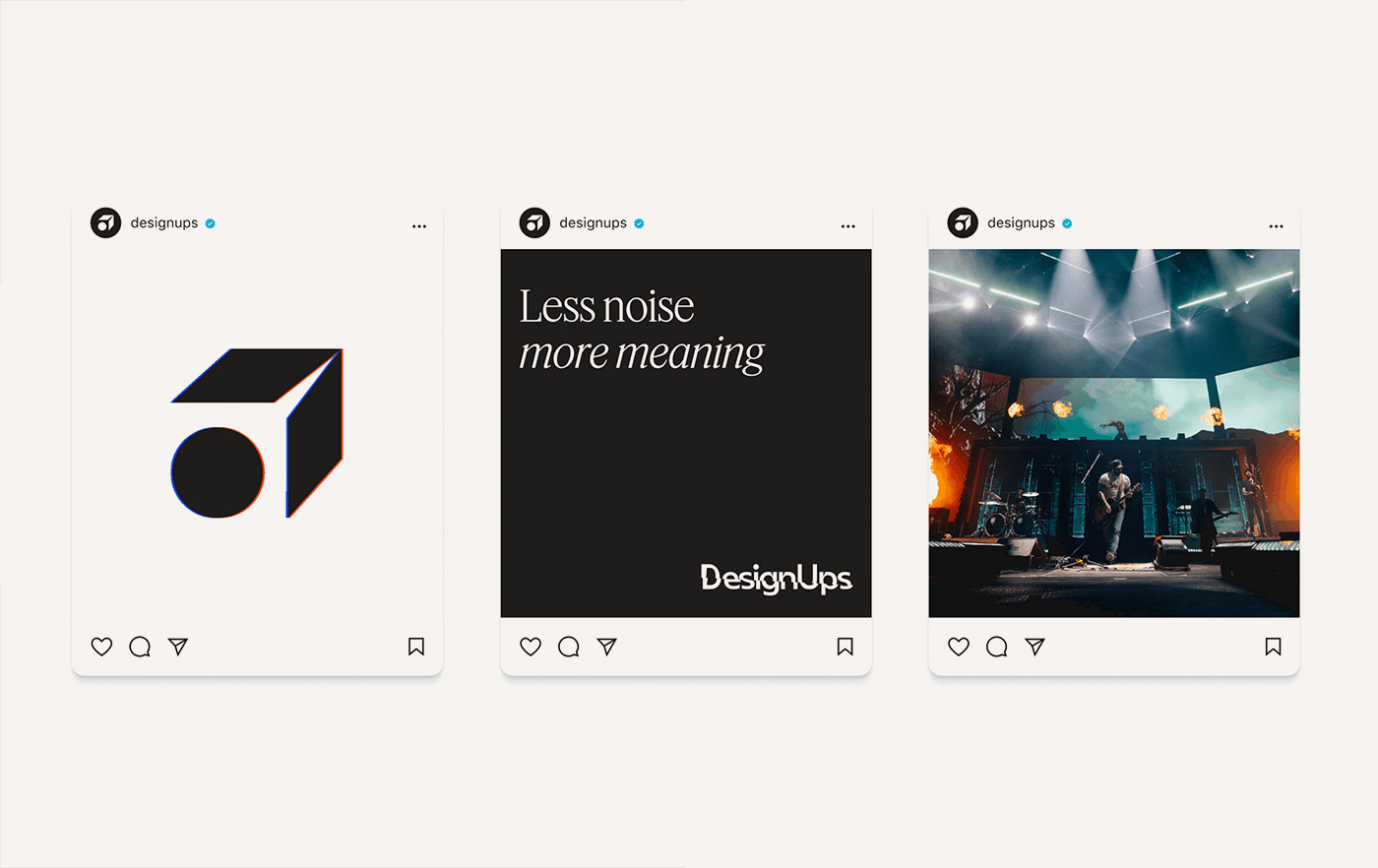
DesignUps Social
Social Media Designs
Our updated content strategy and design stems from our refreshed vision. We are focused on consistently speaking about our company, clients and work with passion and sharing our expertise.
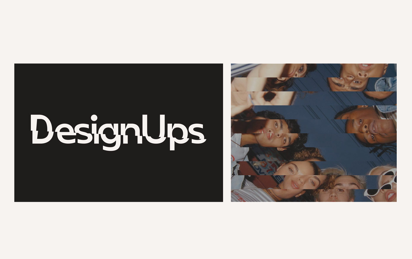
DesignUps Glitch
An Alternate Approach
Sometimes being a bit different is a good thing. The glitch effect we have developed is used sparingly. This is a supporting element that we intend on using in motion design and promotional materials.
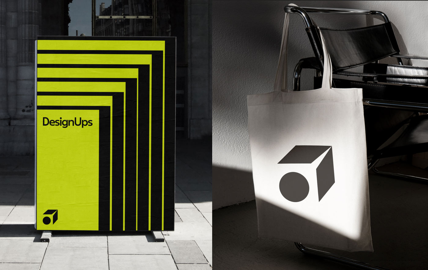
Brand Applications
Our New Brand in the Wild
Having a new brand is great, but we put a lot of thought into how the brand would live in the world. Our brandmark and brand patterns can be applied to environmental designs or branded swag.
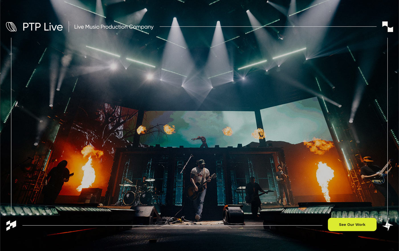
Featured Case Study
Showcasing our Work
We enjoy what we do and took extra care to present our case studies with a unique twist. The frame border incorporates our brand icons alongside the client information to elevate our case studies and put the focus on the work we do.
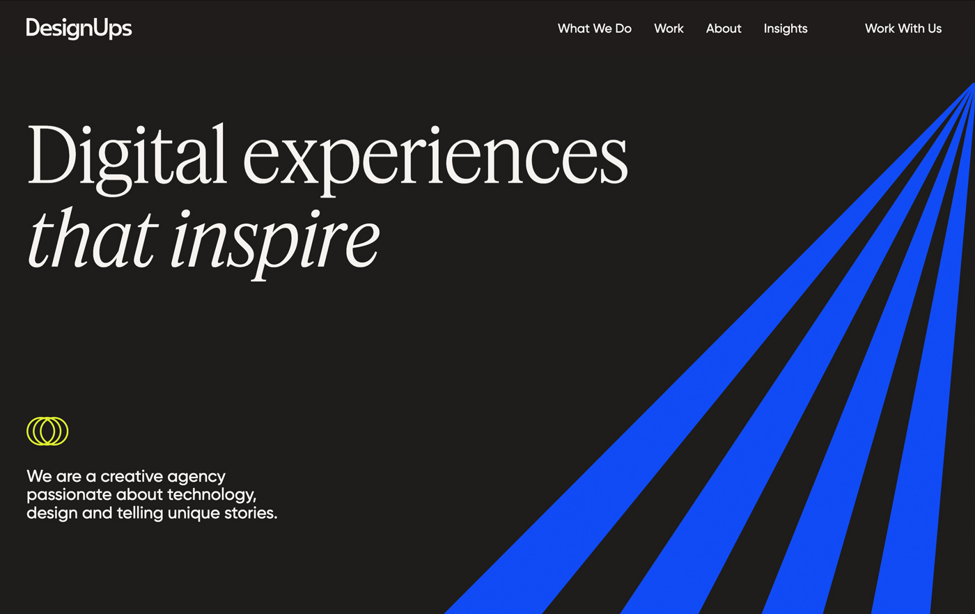
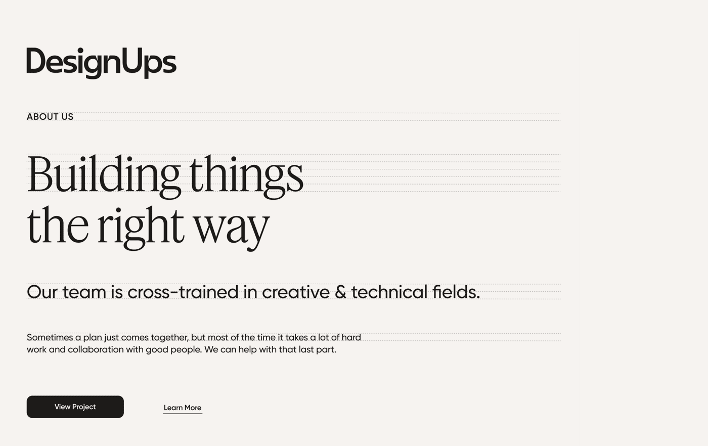
DesignUps website
Our New Website is Here
The new DesignUps website is the culmination of our branding and digital experience strategy. The vision for the new website is bold and ambitious. Our typography, custom iconography and color palette come alive in the context of the website.
We developed the website using scroll-based animation techniques to create a playful and engaging experience and bring our brand to life. As time goes on the website will continue to evolve. We plan on continually adding new content and expanding upon on our strategy and mission as a company.