Technology Startups That Scale
There is a particular challenge that technology startups face when they reach a certain stage of growth: the product has found its footing, users are engaged, and the founding team knows exactly what they are building — but the brand and user experience have not kept pace.
When Potluck came to DesignUps, we did an entire brand audit including the marketing website and application UI/UX. We discovered lots of areas for improvement and came back with a detailed path forward which included refining the brand and completely overhauling the application design.

The challenge: when a good product is held back by its presentation
Good technology products fail to grow for many reasons. Price, market timing, distribution — these are the factors that get discussed most. But a consistently underestimated cause of stalled growth in consumer tech is the gap between what a product does and how it presents itself to the world. A product that is genuinely useful but visually provisional, confusing to navigate, or difficult to explain sends a signal to potential users, investors, and press that does not match its actual quality.
For Potluck, the challenges fell into three connected areas. The brand identity needed a refresh that better captured the warmth, playfulness, and social energy of what the product is actually about. The application UX had accumulated friction — the onboarding flow, the dashboard experience, and the event management tools all had room to become more intuitive and more enjoyable. And the marketing website needed to be rebuilt in a way that communicated the product’s value clearly and drove signups.
Working directly with Potluck’s founder, DesignUps approached all three areas as an interconnected system rather than separate workstreams. The brand decisions informed the UX design. The UX decisions informed what the marketing website needed to communicate. Each layer supported the others.
The brand refresh: making the identity match the product’s energy
Potluck’s product has a distinct emotional register. It is warm, social, and a little playful — it is about backyard dinners and birthday brunches and Friendsgivings, about the particular satisfaction of gathering people you care about without the coordination becoming a full-time job. The brand needed to reflect that energy without tipping into something frivolous. The product is genuinely useful; the brand needed to communicate that usefulness while still feeling like it belongs to the world of good times and real connection.
The visual refresh updated the color palette, typography, and UI elements to create a system that feels modern and clean while retaining the approachability that the product’s audience expects. The work extended to the brand mark itself — one of the details that distinguished this engagement was the creation of animated logo variants that bring the brand mark to life in digital contexts. In a product that lives on mobile screens and in app stores, a logo that moves communicates personality in a way that a static mark simply cannot.
The typography choices reflect a similar balancing act: legible and clean enough for a functional UI, characterful enough to feel like a brand with a point of view. The colour system needed to work across the marketing website, the app interface, and social media — three contexts with different technical constraints and different user expectations.

The application UX redesign: removing friction from every key flow
Redesigning an existing application’s UX is a different challenge from designing a new one from scratch. The existing product has users with established habits, flows that have been tested in the real world, and specific points of friction that have been observed over time. The job is not to start over — it is to identify precisely where the experience is failing the user and address those points with clarity and discipline.
For Potluck, the UX redesign focused on the flows that matter most to the product’s core value: onboarding new users with less friction, creating and managing events intuitively, and experiencing the Moments feature — the private photo feed where the memory-making part of the product lives — in a way that feels natural and worth returning to.
Onboarding and the welcome experience
The before-and-after on Potluck’s welcome and onboarding screens illustrates what good UX work looks like in practice. The updated welcome experience is cleaner, more focused, and more honest about what the product is and why a new user should invest the next two minutes creating an account. The visual hierarchy guides the user forward rather than presenting them with competing information. The emotional tone is set from the first screen — warm, simple, and purposeful.
Reducing onboarding friction is one of the highest-ROI UX interventions available to a consumer app. Every additional step, every moment of confusion, every screen that makes a new user wonder whether this is worth their time is a user the product loses before it has had a chance to demonstrate its value. The redesigned flow removes those moments of doubt.
The dashboard and event management
The dashboard redesign addressed the core navigational experience of the app — how a host sees their events, manages guests, and accesses the key actions they need. The updated design creates a clearer visual hierarchy between active and upcoming events, makes the key host actions immediately accessible, and introduces the kind of visual polish that signals to users that the product is actively maintained and genuinely cared about.
Event creation was given particular attention. Hosts can now see a full guest list with invite responses at a glance, and the option to allow guests to invite their own friends is managed through a clean toggle rather than buried in settings. These are small UX decisions that have a disproportionate impact on how hosts feel about the product — the experience of creating and managing an event should be effortless enough that it does not become a reason not to host.

Moments: the timeline and photo sharing experience
The Moments feature — the private photo feed where hosts and guests can share memories of an event — is one of Potluck’s most distinctive differentiators. It is the part of the product that makes gathering feel meaningful in retrospect, not just logistically managed in the run-up. The redesigned timeline is intuitive and familiar, organized by date in a way that makes scrolling through past events feel like browsing a personal record of time well spent.
The Events Chat was also modernized — a more contemporary interface that makes the coordination function feel less like a project management tool and more like a natural extension of how people already communicate about social plans.
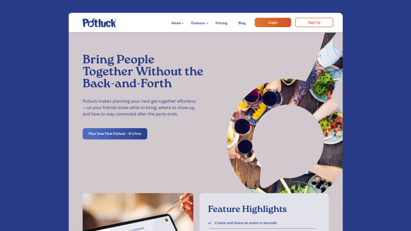
The marketing website: rebuilt on Webflow to showcase the new brand
The marketing website was rebuilt on Webflow — a deliberate platform choice that gives Potluck’s team the ability to update and iterate on the site without developer involvement while maintaining the design quality the refreshed brand demands. For a startup where the founding team’s time is finite and the marketing message will continue to evolve, a well-built Webflow site is a more sustainable long-term asset than a custom-developed site that requires engineering resources to change a headline.
The rebuilt site has one primary job: to communicate what Potluck does, who it is for, and why it is worth trying, in the shortest possible distance from landing to sign-up. The updated brand assets — the refreshed visual identity, the new photography direction, the cleaner typography system — give the site the credibility to make that case to a first-time visitor who has no prior reference point for the product.
The result is a site that looks and feels like a product worth using, which is what a consumer tech marketing website needs to do above everything else.
What this project teaches us about UX design and branding for tech companies
The Potluck engagement is a useful illustration of principles that apply broadly to technology products at any stage of growth. Here are the lessons that transfer most directly.
1. Brand and UX are not separate disciplines in a tech product.
Every screen a user sees inside your app is a brand touchpoint. The colour of a button, the weight of a typeface, the tone of an error message — these are all brand decisions made through a UX lens. Companies that maintain a strict separation between their brand team and their product team produce digital experiences that feel subtly inconsistent, and users notice even when they cannot articulate why. The most effective tech product work treats brand and UX as a single system.
2. Friction compounds. Remove it systematically, not opportunistically.
Every moment of confusion in an app — a navigation that requires thought, an action that takes one step too many, an onboarding screen that does not immediately make the value case — is a small loss. Individually, each one seems minor. Collectively, they determine whether a user becomes a regular or churns. Effective UX work for tech products maps the entire user journey, identifies friction at every step, and addresses it systematically rather than fixing the most obvious problems and stopping.

3. The marketing website and the product experience must feel like the same company.
One of the most common disconnects in consumer tech is the gap between a polished marketing website and a product that does not live up to the promise it made. The inverse is also damaging: a genuinely excellent product hidden behind a marketing site that fails to communicate its value. The work DesignUps did for Potluck treated the website and the app as a continuous brand experience — the visual language, the emotional tone, and the clarity of communication needed to be consistent from the first impression to the hundredth session.
4. For consumer apps, delight is not optional — it is a retention mechanism.
The animated logo mark created for Potluck is a small detail. But small details accumulate into an overall sense of whether a product is alive and cared for. Consumer technology products compete not just on features but on feel — the sense that the product was made by people who genuinely wanted it to be good. Animation, micro-interactions, and visual polish are not cosmetic add-ons to a finished product. They are the texture of an experience that users return to.
Building tech products that are as good to use as they are to look at
Potluck is doing something genuinely valuable — making it easier for people to be together in person, without the cognitive overhead that coordination usually requires. The refreshed brand and redesigned UX give that mission a presentation that matches its ambition. The product now looks, feels, and communicates like the company it has become, not the early-stage version it started as.
For technology companies in Nashville and beyond, the Potluck engagement is a useful model for what integrated brand and UX work looks like in practice. It is not a logo project. It is not a features audit. It is a systematic effort to ensure that every touchpoint — from the first marketing impression to the hundredth in-app interaction — reflects the quality of what has been built and earns the trust of the people using it.
Building a tech product that needs brand and UX work?
DesignUps works with technology startups and growing tech companies on brand strategy, visual identity, application UX design, and marketing website development. If you are building something and the brand or user experience has not kept pace with the product, we would love to hear about it.