Project Type // Live Entertainment
A Modern Website Design for the Ryman Auditorium
DesignUps worked with the Ryman Auditorium as a part of their 125th Anniversary initiatives. The Ryman website was featured as a "webpick" on Communication Arts.
As lifelong music fans, residents of Nashville and aspiring musicians - our team was pumped to parter with the Ryman. We completely modernized their aged website with a streamlined and modern approach. The new design utilizes a combination of textures and photo elements paired with typography inspired by hatch show print.
The best place to catch live music
A big goal of the new website was to make it easier for fans to find shows and book tickets. We built a custom events page on top of WordPress, creating an intuitive events system allowing fans to find and get their tickets easier than ever.
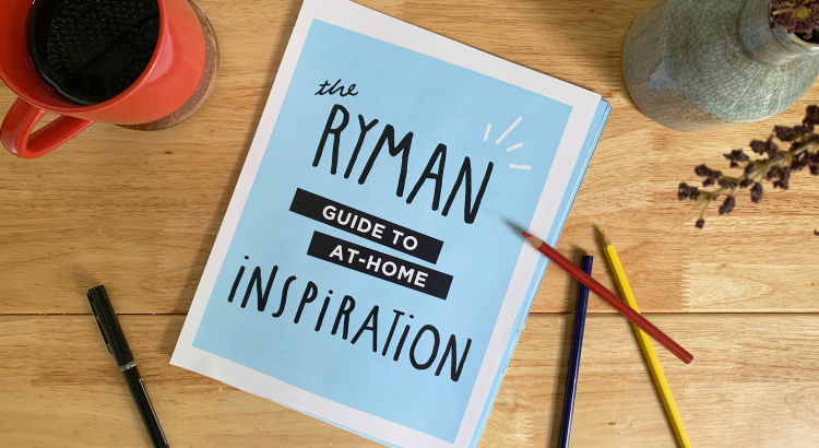

Special Events Get Special Treatment
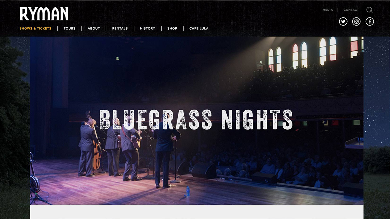
Not all shows are created equal. Special events at the Ryman have recurring schedule such as seasonal Christmas performances or Bluegrass nights. Our design solution accommodated for each event with unique assets.
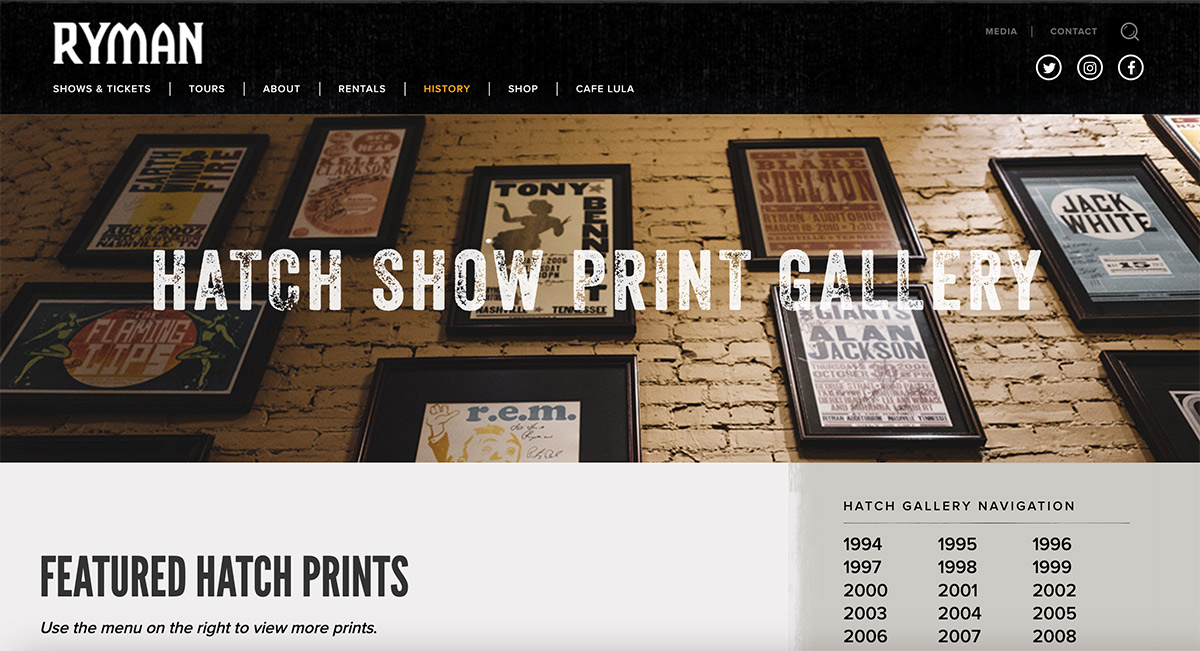
Legendary Letterpress Designs
The Ryman is known as a world class concert venue, but many people overlook influence of hatch show print's music poster designs. Our design allowed visitors to easily navigate between an expansive history of poster designs.
Celebrating 125 Years of History
The Ryman has a storied history which we captured via an interactive timeline. Dozens of events tell the story of the Ryman through the years. The timeline design allows people to easily navigate from the early days to modern times. A user experience that history buffs love.
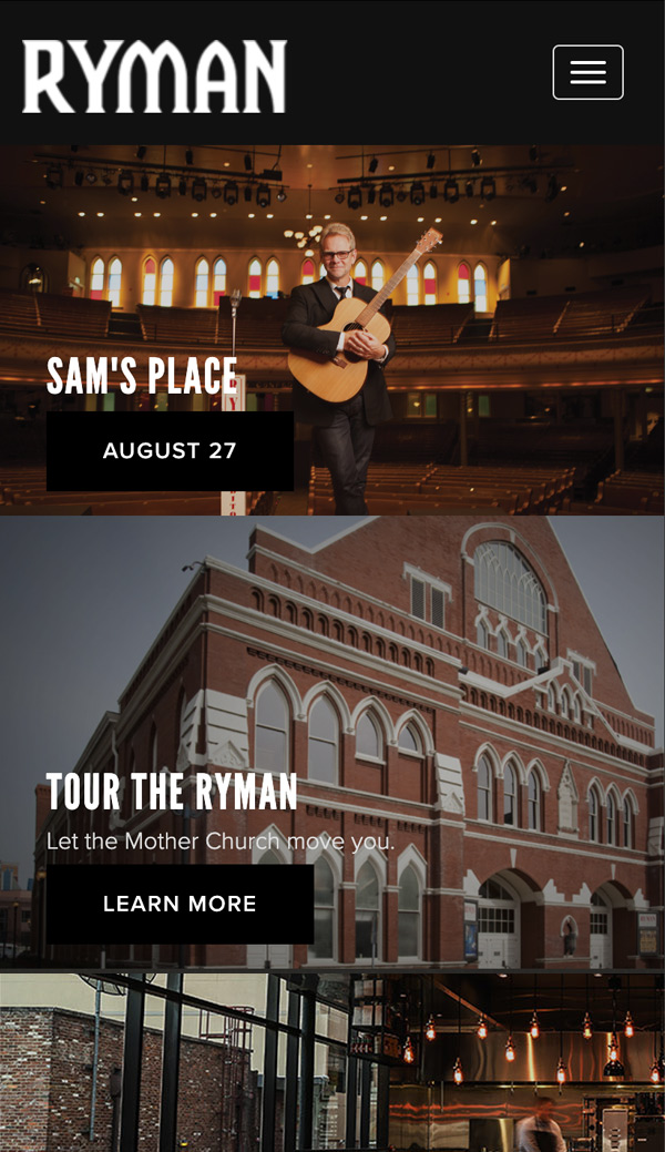
Connecting Fans to Their Favorite Music
People visit the Ryman Auditorium from all over the world. It was critical to connect to fans on the go. Our website design scales down seamlessly to mobile devices. Access to booking shows was a core focus for our mobile experience design.
A Concert Venue And A Museum
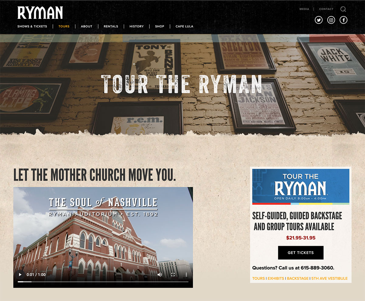
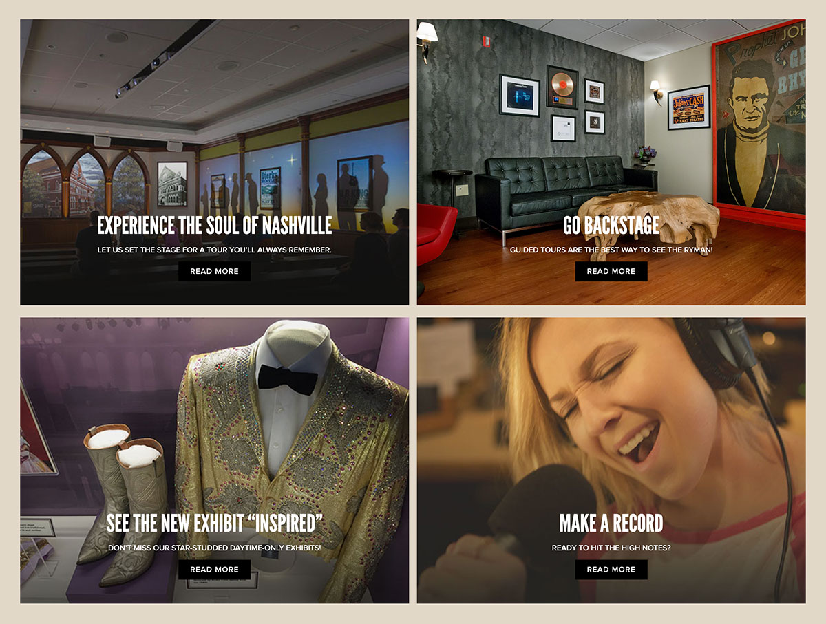
Most people go to the Ryman to see their favorite musician or band. But did you know that you can tour the Ryman Auditorium? We wanted to draw attention to the tours offered and developed a section devoted to educational information and booking tours at the Ryman.
