Rebranding is an important process that any business will have to consider at some point in their development. The landscape is always changing, and some of the best rebrands showcase how companies can successfully adapt to these changes. As new technology, products and services come in, the old ways of doing things become outmoded or obsolete. A good brand should be flexible enough to survive those changes, but sometimes there is simply a need to reestablish a brand’s value in the marketplace.
Here are some of our favorite rebrands in technology from 2016 and 2017:
01. Mozilla brand refresh
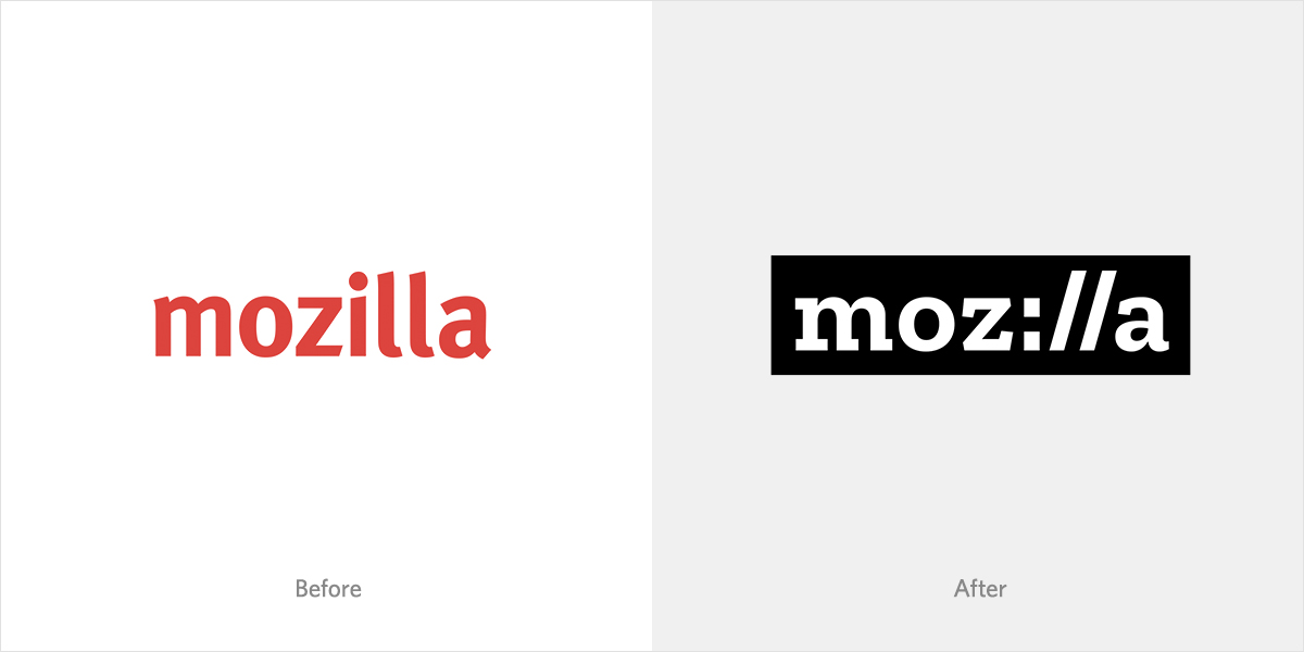
Since its creation in 1998, Mozilla has promoted free and open-source software and a collaborative web community. Mozilla’s challenge was to express this ethos within a new mark and brand refresh. The protocol style of the new mark (shown above) is an acknowledgement of Mozilla’s core values and their origins in the early web. It doesn’t feel forced and reads very well, even with the protocol slash marks. The idea fits Mozilla’s brand and values just perfectly. “Our brand identity – our logo, our voice, our design – is an important signal of what we believe in and what we do. And because we are so committed to ensuring the Internet is a healthy global public resource, open and accessible to everyone, we’ve designed the language of the Internet into our brand identity.” –https://blog.mozilla.org/opendesign/arrival/
Typotheque created a custom font, named Zilla Slab, specifically for the new rebrand. It has a humanist feel that is very comfortable to code with. The angled terminals on the “a” and “z” improve readability and fit very cleanly with the angle of the protocol slashes. By sharing this font, Mozilla has stayed true to its commitment to open source web resources and design. Mozilla remains one of the web’s most respected companies, and it shows here.
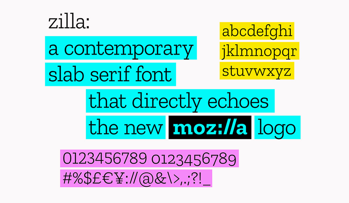
- Zilla Slab can be downloaded at GitHub:https://github.com/mozilla/zilla-slab/
- Keep an eye out for more design tools related to Mozilla’s new branding system to be released in the near future:https://blog.mozilla.org/opendesign/
02. Watson new identity
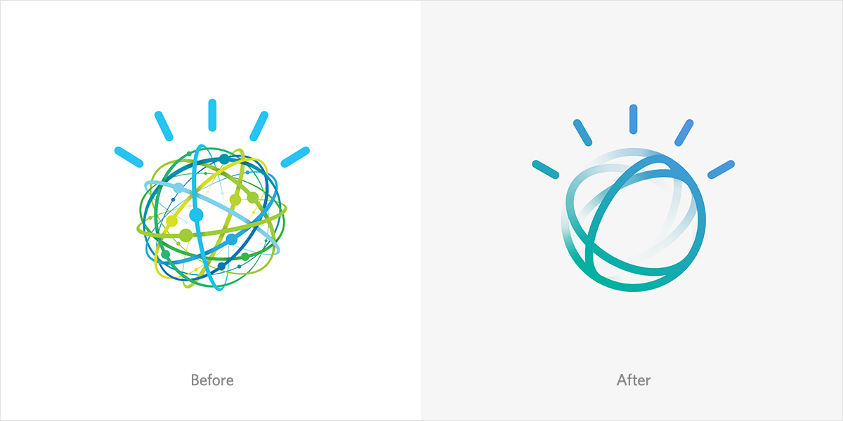
Watson, IBM’s cognitive AI system, underwent its first rebrand to better reflect its advanced capabilities. It was first used to answer questions on the quiz show Jeopardy. In 2011 it defeated all human challengers including previous 2004 champion Ken Jennings. But its purpose was not merely entertainment. Watson was designed to analyze and interpret data with a more human-like thought process. In 2013 Watson was used to help doctors make treatment decisions in lung cancer patients. The new mark appears clean, expressive, friendly, and responsive.
The old logo now feels very cluttered by comparison. The animated logo looks as if it can speak to you. But even in its static form it very much takes on a life of its own. The Watson mark is inspired by the “Smarter Planet” logo (below) and retains much of the visual language.

03. Kodak visual identity
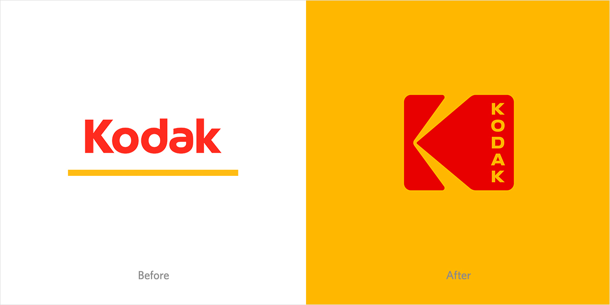
Kodak’s new branding is a great example of modernizing an old style and bringing it back to life, aligning with the cultural zeitgeist. After multiple rebrands, a logo can sometimes begin to seem distant from the values that shaped the company it represents. Think of “New Coke” as an example of losing focus on the strength of a venerable brand. Kodak has had to keep up with emerging image technologies without abandoning everything that had made it a great photography company in the first place.
The new Kodak logo (to the right) strikes a nice balance between the old and the new. The familiar shutter icon has returned with some minor color and shape adjustments, and a fresh take on the typography. It would almost seem a rule of thumb to never use vertical type for a logo, but it works very well here. This mark comes off as much stronger and more memorable than their 2006 rebranding attempt (at left).
Kodak still produces traditional film for the movie industry and is re-releasing some 35mm rolls, such as Ektachrome for point-and-shoot or SLR camera users. Traditionalists and hobbyists alike will appreciate this direction. Vinyl records have made a big comeback over the last few years. Could film see a similar rebirth?
Rebranding Strategies
Rebranding is a complex process that requires careful planning and execution. A successful rebranding strategy involves a deep understanding of the brand’s target audience, values, and mission. Here are some key rebranding strategies to consider:
- Define your brand purpose: Clearly articulate your brand’s reason for being and what sets it apart from competitors. This foundational step ensures that your new identity is rooted in your core values and mission.
- Conduct market research: Gather insights from customers, employees, and stakeholders to inform your rebranding decisions. Understanding their perceptions and expectations can guide your strategy and help you stay relevant.
- Develop a unique value proposition: Create a compelling statement that communicates your brand’s unique benefits and value. This proposition should resonate with your target audience and differentiate you from the competition.
- Create a new visual identity: Design a new logo, color palette, typography, and imagery that reflects your brand’s personality and values. A cohesive visual identity can significantly enhance brand recognition and loyalty.
- Update your brand messaging: Craft a new tone of voice, language, and messaging that resonates with your target audience. Consistent and clear communication is key to reinforcing your brand story.
- Engage your employees: Educate and empower your employees to become brand ambassadors and champions of the new brand identity. Their buy-in is crucial for a successful transition.
- Launch a phased rollout: Introduce the new brand identity in stages to minimize disruption and ensure a smooth transition. This approach allows for adjustments based on feedback and helps maintain continuity.
Brand Identity Evolution
A brand’s identity is not static; it evolves over time as the company grows, adapts, and responds to changing market conditions. Here are some key factors that influence brand identity evolution:
- Changes in target audience: As your target audience shifts, your brand identity may need to adapt to resonate with new demographics, interests, or values. This ensures that your brand remains relevant and appealing to new audiences.
- Market trends and competition: Stay ahead of the competition by monitoring market trends and adjusting your brand identity to stay relevant. Being proactive in your approach can help you maintain a competitive edge.
- Brand expansion or contraction: As your company expands or contracts, your brand identity may need to adjust to reflect new products, services, or business models. This flexibility is essential for growth and sustainability.
- Cultural and social shifts: Brands must be sensitive to cultural and social changes, adapting their identity to reflect evolving values and norms. This responsiveness can enhance your brand’s connection with its audience.
- Technological advancements: Leverage new technologies to enhance your brand identity, such as digital platforms, social media, and data analytics. These tools can provide new ways to engage with your audience and tell your brand story.
The Importance of Visual Identity
A strong visual identity is crucial for building brand recognition, trust, and loyalty. Here are some key elements of an effective visual identity:
- Logo design: A well-designed logo is a critical component of your visual identity, conveying your brand’s personality, values, and mission. It should be memorable and versatile, working across various mediums.
- Color palette: Select a color palette that reflects your brand’s personality and resonates with your target audience. Colors can evoke emotions and associations, making them a powerful tool in your branding arsenal.
- Typography: Choose typography that is consistent with your brand’s tone and personality, and use it consistently across all marketing materials. Typography can enhance readability and reinforce your brand’s message.
- Imagery: Develop a consistent visual style for your imagery, using high-quality images that reflect your brand’s values and personality. Imagery can tell a story and create a strong visual connection with your audience.
- Iconography: Use icons and graphics to add visual interest and reinforce your brand’s message. Well-designed iconography can simplify complex information and enhance user experience.
Best Practices for Rebranding
Rebranding can be a complex and challenging process, but with careful planning and execution, it can be a powerful tool for revitalizing your brand. Here are some best practices to keep in mind:
- Conduct thorough research: Gather insights from customers, employees, and stakeholders to inform your rebranding decisions. This research can provide valuable perspectives and guide your strategy.
- Develop a clear brand strategy: Define your brand’s purpose, values, and mission, and ensure that your rebranding efforts align with these goals. A clear strategy provides direction and coherence.
- Engage your employees: Educate and empower your employees to become brand ambassadors and champions of the new brand identity. Their support is essential for a successful rebrand.
- Launch a phased rollout: Introduce the new brand identity in stages to minimize disruption and ensure a smooth transition. This approach allows for adjustments based on feedback and helps maintain continuity.
- Monitor and adjust: Continuously monitor the effectiveness of your rebranding efforts and make adjustments as needed to ensure that your brand stays relevant and competitive. Flexibility and responsiveness are key to long-term success.


