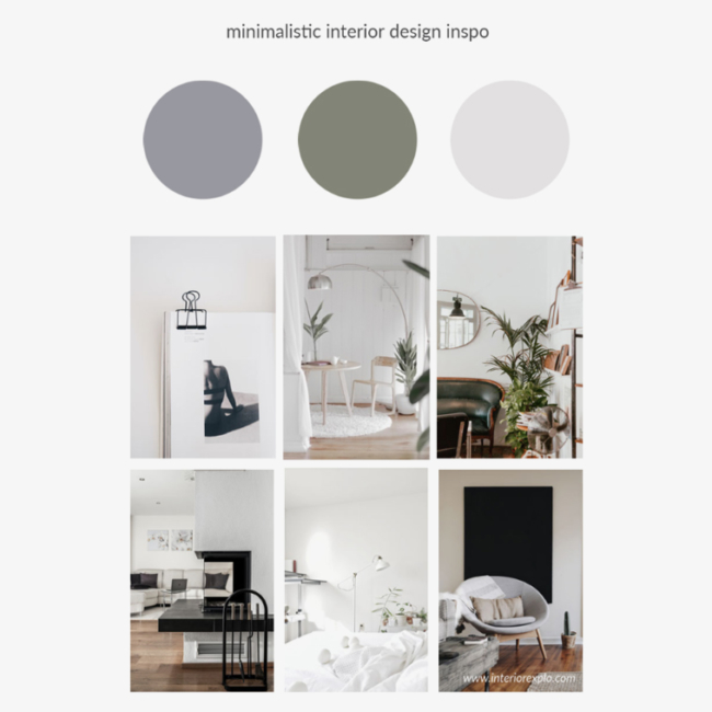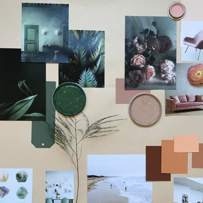
Visually representing inspiration through a mood board is the most effective way to convey your design ideas in the actual design process. To create mood boards, you can use both digital and physical formats to gather inspiration and align team visions. It becomes even more critical when working with a team of creatives in which everyone has their hands in the design process. Sometimes even your client doesn’t have a specific visual direction in mind. Creating a mood board can quickly get everyone on the same page and facilitate a smoother, more collaborative approach to any design project.
What is a Mood Board?
A visual tool to communicate design concepts and ideas
A mood board is a powerful visual tool that encapsulates the aesthetic, tone, and atmosphere of a project. It’s essentially a curated collection of images, colors, textures, and sometimes even typography that collectively evoke a specific mood or feeling. Designers, illustrators, photographers, and filmmakers often use mood boards to communicate their creative vision and inspire their work. By visually representing the desired outcome, mood boards make abstract ideas more concrete and accessible.
A way to build consensus and facilitate emotional connection
Mood boards are invaluable for building consensus among design teams and stakeholders. They provide a clear visual direction, ensuring that everyone involved in the project is on the same page. This alignment is crucial, especially when the client or team members have different interpretations of the project’s goals. Additionally, mood boards help facilitate an emotional connection with the user by defining the primary UI colors and visual identity, which are essential components of user experience. By setting the emotional tone early on, mood boards guide the design process towards a cohesive and impactful outcome.
A strategic tool for various design projects
The versatility of mood boards makes them a strategic tool across various design disciplines. Whether you’re working on branding, graphic design, fashion, cinema, industrial design, or interior design, mood boards help ensure that all design elements cohesively mirror the intended mood and style. They serve as a reference point throughout the design process, helping to maintain consistency and focus. By visually mapping out the project’s aesthetic, mood boards enable designers to explore different directions and make informed decisions that align with the overall vision.
Benefits of Using a Mood Board in the Design Process
Visualize and Communicate Design Concepts
Mood boards are an essential part of the design process, serving as a vital tool for visualizing and refining design concepts before diving into the actual design work. They help designers and design teams to communicate their ideas more tangibly, making it easier for clients to understand and engage with the proposed visual direction. By presenting a cohesive collection of visual elements, mood boards ensure that everyone involved in the project is on the same page, reducing the risk of miscommunication and aligning expectations. This clarity and alignment are crucial for a smooth and efficient design process, ultimately leading to a more successful and cohesive final product.
Brainstorm
It’s always a good idea to start with some verbal brainstorming. Asking questions about the message and overall feeling you want to communicate helps you understand what words and phrases to reference in your search for imagery. How do you want the viewer to feel? What values do you want to convey to the audience? Jot down all the words you think of, and then look up their synonyms. Creating a word cloud can help determine what terms represent your ideas best. This initial brainstorming is a crucial part of the design thinking process, which emphasizes empathizing with users, defining problems, ideating solutions, prototyping, and testing.
Colors
Color plays a prominent role in the perception of a brand. Choosing the right colors to express and provoke a desired feeling visually is very important. The right colors will relay the message you’re trying to send within the first few seconds of someone viewing your work. Color psychology and color theory should be referenced in this process. Play around with saturation and luminance while developing your color palette. There are so many possibilities in the realm of color!
Additionally, digital mood boards allow for dynamic features such as videos and sound, which are essential for setting the mood and facilitating remote collaboration among team members.
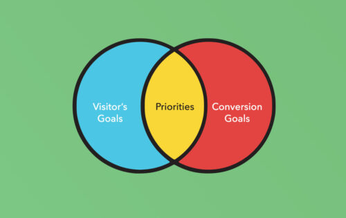
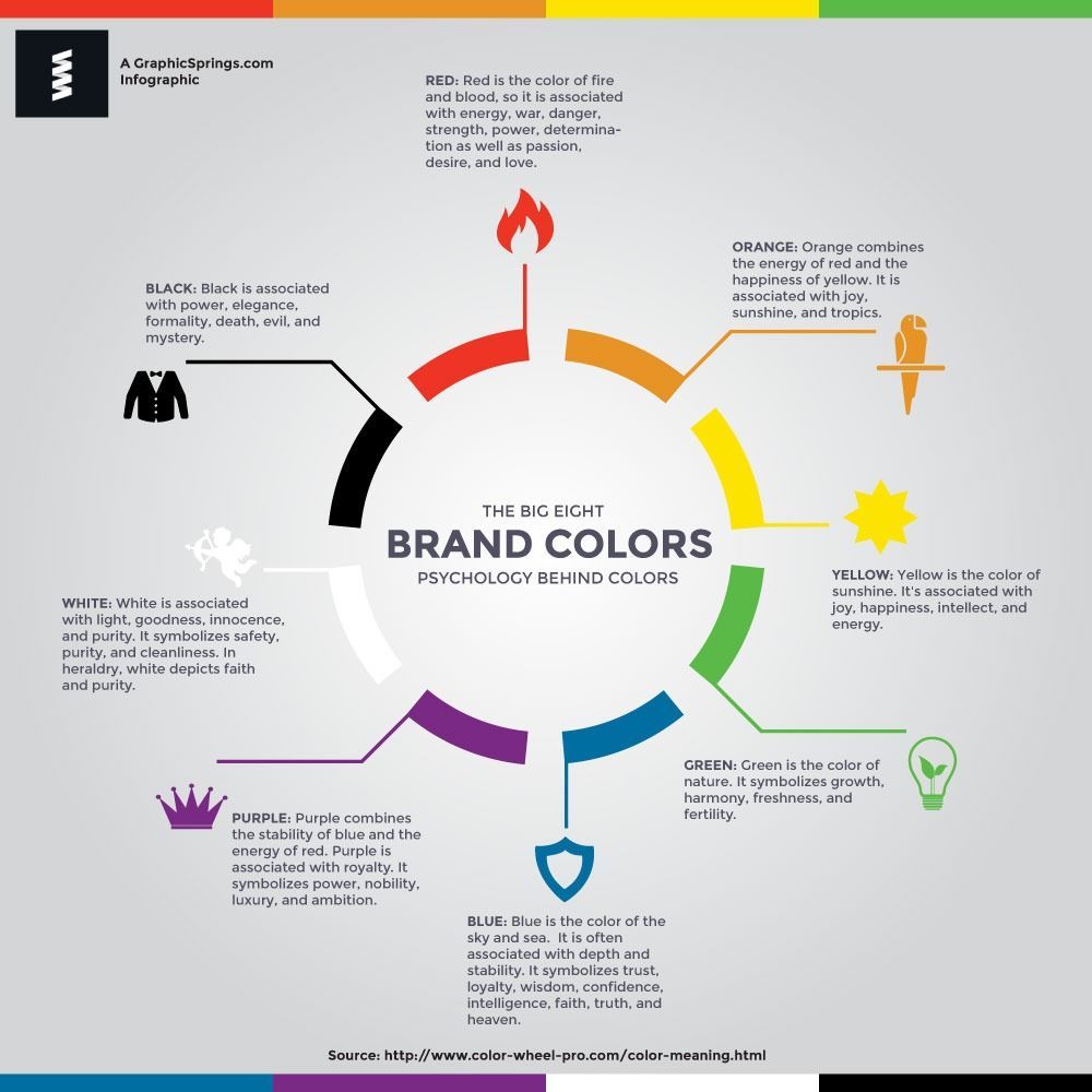 Infographic by GraphicSprings
Imagery and Visual Elements
When choosing images for a good mood board, make sure that each one contributes something to the overall message. If you’re on the fence about an image, scrap it and look for a stronger, more relevant photo. The process of gathering images is up to the creative, but popular sites like Pinterest, Designspiration, and WeHeartIt are all great places to start. Search the words and phrases you brainstormed, trying different combinations and tenses. It’s essential to store all the relevant images you find, just in case you need to change something later or perhaps just need more inspiration. Both Google Drive and Pinterest allow for collaboration and sharing among the entire team.
Layout and Design Process
How you organize your images is essential in emphasizing the tone of your mood board. Structured, evenly spaced photos create a minimal, orderly aesthetic. In contrast, a collage of stacked photos in various shapes and sizes can have a more whimsical, creative look. Be conscious of the images you put next to one another. Make sure no part of the board is too overwhelming. Your layout should align with the overall visual message you’re trying to send.
Both physical mood boards and digital mood boards have their unique advantages. Physical mood boards engage designers with tangible elements but may be less convenient for sharing and collaboration, while digital mood boards offer dynamic features and easier accessibility for remote teams.
Programs like Canva, Adobe Illustrator, and Adobe Photoshop make creating mood boards easy and fun, but you can also make a physical one by printing your images and collecting materials elsewhere. Just don’t forget to include your color palette!
Options
As mentioned before, sometimes the project you’re working on doesn’t have a defined aesthetic yet, or you may have been given a description that is contradictory or too vague. In this case, try creating your own mood board. Change the colors, focus on a specific subset of buzzwords, try different layouts, etc. This can help in narrowing down exactly what the project should look like. Be open to combining different aspects of the boards or changing them completely based on feedback.
As you move through the design process, use your mood board for inspiration and justification in your creative decisions. Keep a copy of it within view at all times so that you are continuously pulling inspiration from the source. If the board begins to feel stale, create supporting boards with more images and design ideas.
Remember, the most important thing is to keep it creative! Mood boards should facilitate the design process, not restrict it. Good luck and happy creating!
