What is Responsive Web Design?
Responsive web design is a modern approach to web development that ensures your website looks great and functions well on any device, whether it’s a desktop computer, tablet, or mobile phone. This technique involves creating web pages that can adapt to various screen sizes, resolutions, and orientations. By using flexible grids, flexible images, and media queries, responsive web design allows your content to be easily readable and navigable across different devices. It’s not a standalone technology but a set of best practices aimed at delivering a seamless user experience, regardless of the device being used.
Key Principles of Responsive Design
To create a truly responsive site, there are several key principles you should follow:
- Flexible Grids: These grids can adjust to different screen sizes and resolutions, ensuring your layout remains consistent.
- Flexible Images: Images that scale up or down depending on the screen size help maintain visual integrity.
- Media Queries: These allow you to apply different styles based on the screen size and device, making your design adaptable.
- Mobile-First Design: Start by designing for mobile devices and then scale up for larger screens. This ensures a solid foundation for smaller devices.
- User-Centered Design: Always prioritize the user’s needs and experience. A responsive web design should be intuitive and user-friendly.
By adhering to these principles, you can create a responsive web that offers a great user experience on any device.
What Makes a Good Responsive Web Design Framework?
When choosing a responsive web design framework, look for the following characteristics:
- Flexibility: The framework should easily adapt to different screen sizes and resolutions, ensuring your site looks good on any device.
- Customizability: It should allow for easy customization of design and layout to fit your specific needs.
- Responsiveness: The framework must respond well to various devices and screen sizes, providing a consistent user experience.
- Accessibility: Ensure the framework is accessible to users with disabilities, adhering to web accessibility standards.
- Browser Compatibility: The framework should work seamlessly across different browsers and devices, ensuring a wide reach.
A good responsive web design framework will help you build a site that is both functional and visually appealing across all devices.

Responsive Layout Technologies
Several technologies can help you create responsive layouts:
- Fluid Grids: These grids are flexible and can adapt to different screen sizes and resolutions, maintaining a consistent layout.
- Flexbox: This layout mode allows you to create flexible and responsive layouts with ease, making it a popular choice among designers.
- CSS Grid: Another powerful layout mode, CSS Grid, enables you to create complex and responsive layouts with minimal effort.
- Media Queries: By using media queries, you can apply different styles based on the screen size and device, ensuring your design adapts to various conditions.
These technologies are essential tools in a responsive web designer’s toolkit, helping you create web pages that render beautifully on any device.
Designing for Mobile Devices
Designing for mobile devices requires a different approach than designing for desktops. Here are some key considerations:
- Screen Size: Mobile devices have smaller screens, so prioritize content and use clear, readable typography.
- Input Methods: Mobile devices rely on touch screens, so design for touch interactions with larger buttons and touch-friendly elements.
- User Behavior: Mobile users often have different behaviors than desktop users, such as shorter attention spans and a preference for quick, easy access to information.
- Performance: Mobile devices have limited processing power and memory, so optimize your site for performance to ensure fast load times and smooth interactions.
By keeping these factors in mind, you can create a responsive web design that provides an excellent user experience for mobile users.
What makes a good Responsive Web Design Framework with Media Queries?
Most sites these days are based on top of pre-existing Responsive Web Design Frameworks. As a web designer or a developer who is about to build a new site, it’s important to know which framework is going to be the best for your needs. Some frameworks are supported by huge companies, while others are more minimal and aimed for developers looking for snippets of code to integrate into an existing project.
This blog post covers some of the more popular responsive frameworks and a few lesser-known frameworks that we have enjoyed working with as well.
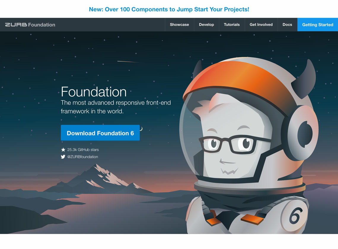
The Foundation framework by Zurb is a heavily customized front-end framework with lots of built-in tools for developing responsive web design and mobile themes / email templates. Foundation is notably used by Mozilla, Facebook, and several other large-scale organizations. The complexity of Foundation can be useful for large-scale web applications or websites with a heavy amount of UX needs. Under the hood, Foundation utilizes GPU acceleration for faster-than-usual animations and user feedback. When loading on a mobile device, the Fastclick.js library enables a smooth experience. Coding with Foundation is typically done on the Sass preprocessor which has one notable difference – a data interchange attribute, which allows developers to specify code to load either on desktop or on mobile.
For skilled developers, Foundation could be a great choice. Although it is complex, it could be re-purposed for multiple projects and become an important, pardon the pun.. foundation for your work. However, this same complexity makes Foundation a poor choice for newer developers and folks who want just a few minimal features.
Most developers will already be familiar with Bootstrap, which was originally authored by Twitter’s developer team back in 2011. Over the years, the framework has been adapted for various uses and is currently on version 4.0. The reason for Bootstrap’s popularity is that it encompasses all the basic necessities for building websites and apps. The responsive web design grid system in Bootstrap works well and has several customizable options.
Bootstrap may be a good foundation for you if you lack the skills to create custom UI elements or want to get something online quickly with minimal customizations. However, the drawback to using Bootstrap is that there are too many built-in options. The amount of CSS and JavaScript that comes pre-packaged is quite heavy on page load, although there are options to download custom builds with less unnecessary code. Another reason to consider alternative frameworks is that Bootstrap is in fact the most popular framework, so if one of your criteria is to stand out, you would not want to use pre-packaged styles as provided in Bootstrap.
This framework is based upon Google’s hugely popular Material Design – which is a design collection for common UI needs across the web and mobile. Relying on flat design and heavily simplified user interactions, Materialize has beautiful built-in design solutions for complex problems. One unique aspect about Materialize is that users have 4 main categories where they can insert code: JavaScript, CSS, Mobile, and Components. Each area has numerous examples and demonstrations on how to customize material design based on your unique needs.
This responsive web design framework is fairly new but is surging in popularity. Anyone familiar with Google Material Design will enjoy this framework. For mobile-based applications, this framework might be one of the best choices.
Semantic UI is quickly gaining a large following in the design community because of its simplistic and straightforward code. The interface is minimal and well thought-out with many handy modules and a complete theming guide. Another benefit of having a minimal and lightweight starting point is that it’s easy to add and remove 3rd party JavaScript libraries. If you have framework fatigue, or are new to development and want to start with something that will be easy to get started with, Semantic UI could be a great choice.
The Cascade framework is a very bare-bones CSS framework without a lot of extra add-ons or frills. The framework is flexible with semantic and non-semantic coding practices that could appeal to a wide range of developers. Quite a few beginning templates are available on the Cascade website although most of them are focused on marketing type websites and blog layouts. One of the things that makes Cascade worthy of being on this list is the modular way of allowing developers to incorporate specific features. Depending on your project needs, you can add or remove the modules which are helpful. In this way, it does a better job than Bootstrap of flexibility in builds.
Cascade is a framework you may want to try if you like Bootstrap but want to explore something more simplistic which is still customizable.
Want to get basic? Want to start with almost nothing and geek out on building a highly optimized project square by square? This may be the framework for you. The framework is so lightweight because the creators want to give more control over styling to the developers. This could be a drawback for more novice developers as they will find themselves having to create more code versus editing existing code. A veteran developer who is looking for a minimal starting point might really appreciate this responsive web design framework. The documentation is very straightforward and should be easy enough to get set up for novices as well.
What makes a good Responsive Web Design Framework?
- Responsiveness: The framework must respond well to various devices and device widths, providing a consistent user experience. This includes using the viewport meta tag with the syntax ‘width=device-width’ to ensure mobile browsers use the actual width of the device. Media queries should also target device width properties to apply specific styles based on the actual dimensions of the device rather than just the browser window.
- Ease of Use: The framework should be easy to use and integrate into your projects. This includes good documentation and a supportive community.
- Customizability: The framework should allow for customization to fit the specific needs of your project. This includes the ability to add or remove components as needed.
- Performance: The framework should be optimized for performance, ensuring fast load times and smooth interactions.
- Support and Updates: The framework should be actively maintained and updated to keep up with the latest web standards and technologies.
Are you looking to create a custom Responsive Web Design?
DesignUps has a team of web developer experts who can assist you with your project! Contact us for more information.


