The future just got a whole lot darker, and it’s not just Apple users who are embracing it. While dark interfaces have been around for a while, there’s been an increase in dark mode options just in the past year among computer operating systems and smartphones. Dark mode can make it easier on the eyes while we’re constantly surrounded by screens, you can extend your battery life with less light, and many users agree that it’s aesthetically pleasing.
The brightness on your screen can commonly cause eye fatigue, migraines, and sleep disruption. Many dark mode users find that the feature helps with these ailments. If done correctly, the contrast in light and dark on the screen can improve readability while in dark mode. It’s important to note that automatic dark mode features can help when out using a device in bright light, and the full use of dark mode at night will show a noticeable difference in readability and accessibility of content.
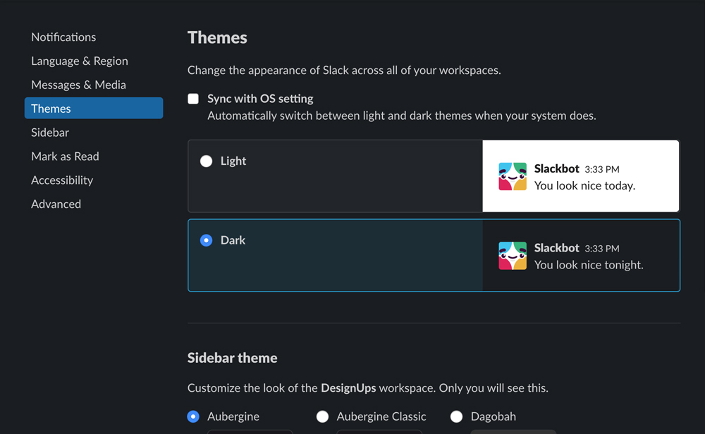
What used to be known as night mode is now a popular concept to use during all parts of the day. Dark mode is becoming the norm, and it’s apparent that designers and web developers need to pay attention. An automatic dark mode feature can also be enabled on many devices, so those who still only want to use dark mode at night can have it auto adjust based on the time. These adjustments make the most out of your battery life, so battery won’t need to be replaced as often and you won’t have to charge your device as frequently.
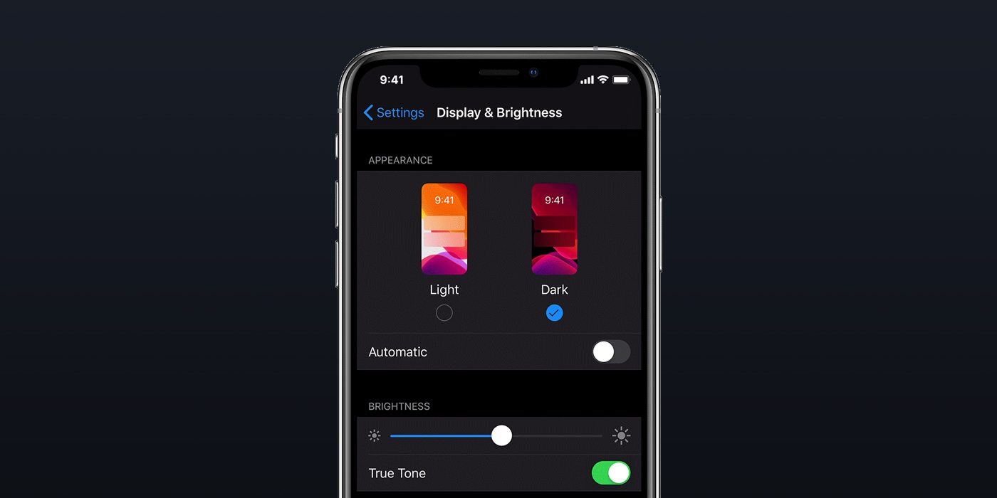
Dark mode may take some trial and error amongst developers, as everything doesn’t always look the best or promote readability in dark mode. It’s important to test the varied level of contrast with font and background colors to see what works. Simple browser add-ons don’t always convert to dark mode seamlessly, so it’s now up to developers to create code that auto adjusts from light to dark based on if a user has dark mode enabled. The CSS option called “prefers-color-scheme” is now supported in Google Chrome, and hopefully all web browsers adapt. Once all websites can utilize both light and dark, a company’s brand can hold up and the aesthetic of a site can be used to its full advantage.
In an evolving technological world, Dark Mode is an exciting feature that is here to stay. Many improvements will most likely be made in the near future, so look out for better readability and transitions from light to dark on our screens. It’s time to embrace the dark side and adapt your website to a new era.
