The year 2020 is right at our fingertips, so what trends and possibilities should we look out for in the web design world? Many new trends, styles, and existing techniques will set the tone for the next decade and encourage a new year of innovation. Designers are leaning towards embracing dark mode, smart video and 3D design, and minimalism combined with playful characteristics.
Since many operating systems are supporting dark mode now, users are increasingly adopting dark mode for aesthetic purposes, better night vision, and less strain on the eyes. Apple even offers advice on how to adapt to dark mode, and it certainly encourages a more thoughtful approach to design based on the user’s display. Web developers can now utilize the “prefer-color-scheme” in code to alter elements in favor of more contrast, degree of dark, and change in color. It’s important to understand that your design can be less effective if you’re not catering to dark mode, and with increased popularity it’s clear that developers will be embracing the dark side in the new year.
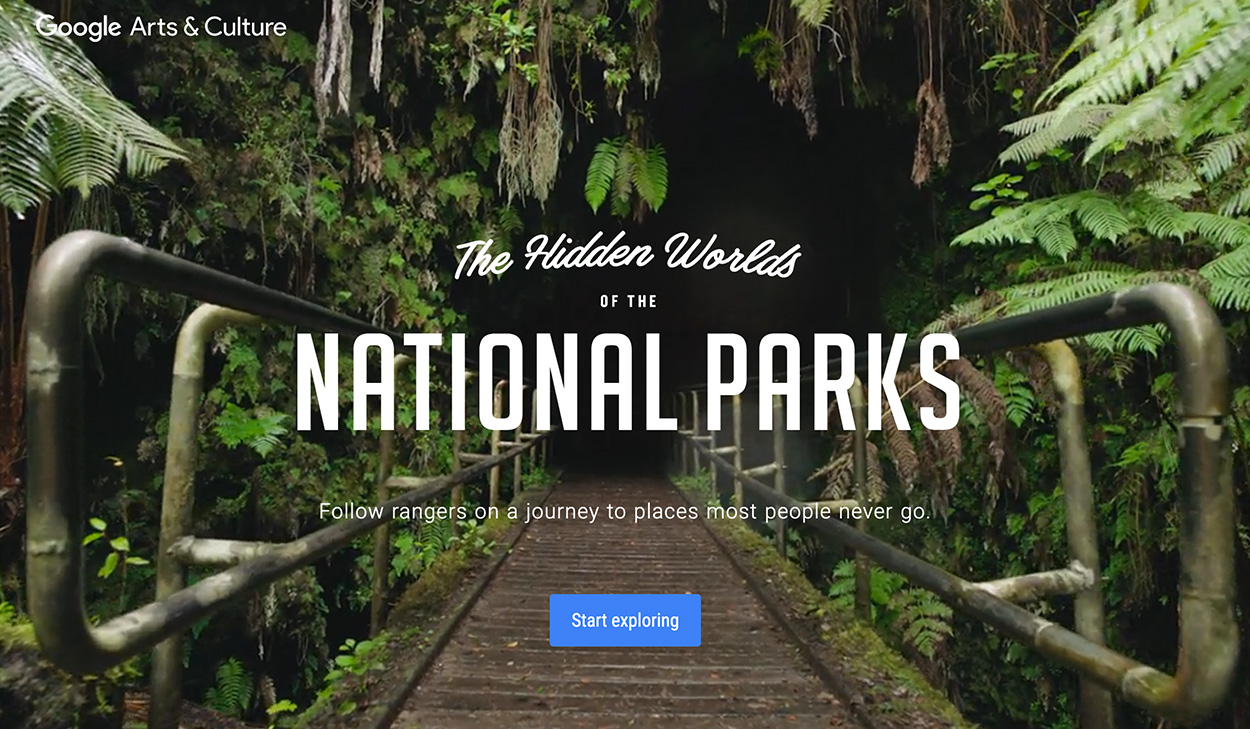
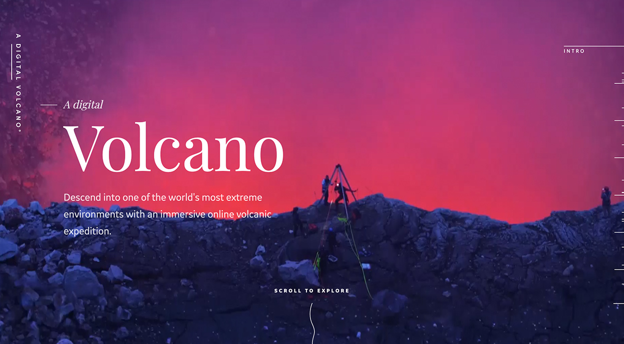
Smart video and 3D design are two more complex features that are evolving and being featured more. Using videos, animation, parallax scrolling, and a combination of these elements is a forerunning theme for many web developers and designers. 3D design is becoming more available, and it certainly creates an edge and level of sophistication. The Hidden Worlds of the National Parks is a great website example that utilizes 360 degree videos and parallax scrolling to create an immersive experience. A Digital Volcano is another great example that exemplifies all 3 elements of animation, parallax scrolling, and video. With this hands on and interactive display, video and 3D design are here to impress in 2020.
In contrast to high-end sophistication, there is also a place for minimalist design and whimsical imperfections. We’re now seeing a trend of large white spaces and layouts that offer an ease of navigation, which can be effective for focusing on important elements and avoiding distractions for the online user. Many sites and businesses are also embracing doodle-like text and icons. Cartoons and more hand designed elements add a more human flair and capture a personality that can enhance branding.
There are certainly many trends to look out for in the new year, and dark mode, 3D design, and minimalism are just a few that will take precedence when we enter the new decade. Pay attention to more colorful and innovative design approaches, and look forward to a new way of adapting web design to smartphones and more optimistic ideals. The future and the past will meld for a revolutionary decade in design. Merchandise design is another area to watch such as trending shirt design.
Check out these trendy sites:
kanarys.com
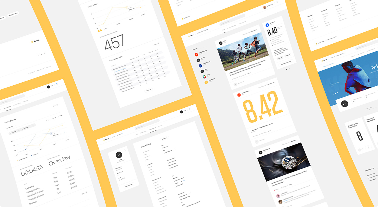
Kanarys is a great example of parallax scrolling, and the website showcases plenty of white space with colorful graphics for a very compelling, modern design. Their video placement also complements the parallax feature, so that user’s can stay engaged while seamlessly navigating the site.
cobosrl.co
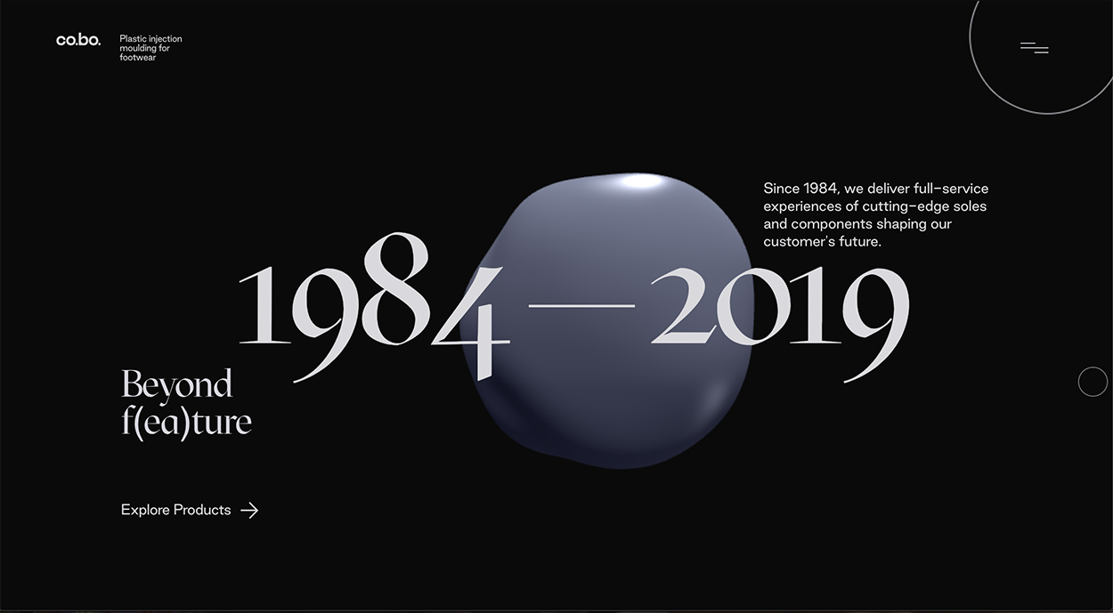
Cobo combines animation and minimalism to display a sophisticated design. Their animated graphics and photos capture their product beautifully, and they utilize parallax scrolling with an immersive method. This not only is interactive for user, but displays the companies info with ease and in a modern way.
gruev.space
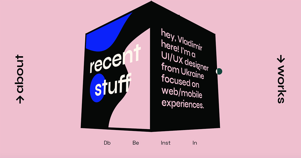
Gruev demonstrates an artistic approach with an interactive display. The single page home page transforms into collage of colorful work when navigating to the “works” page, making the content super intriguing.
